Clinical Workflow Messaging

A redesigned messaging system for clinics

Design Role
  • Research
  • UX Design
  • Visual Design
Deliverables
  • User Interviews
  • User Stories
  • Competitive Analysis
  • Prototype
Specs
  • Duration
  • 5 months
Overview
Healthvana is a patient engagement platform that was designed to instantly deliver test results in a way that is fast and eases anxiety. We work with sexual health clinics to deliver HIV-related test results to patients across the U.S. and to aid in PrEP adherence and retention with technology.

Our biggest client is the Aids Healthcare Foundation, or AHF. We provide a platform for patient communication, results delivery, adherence and notifications, scheduling, and in-clinic patient management.

The Problem
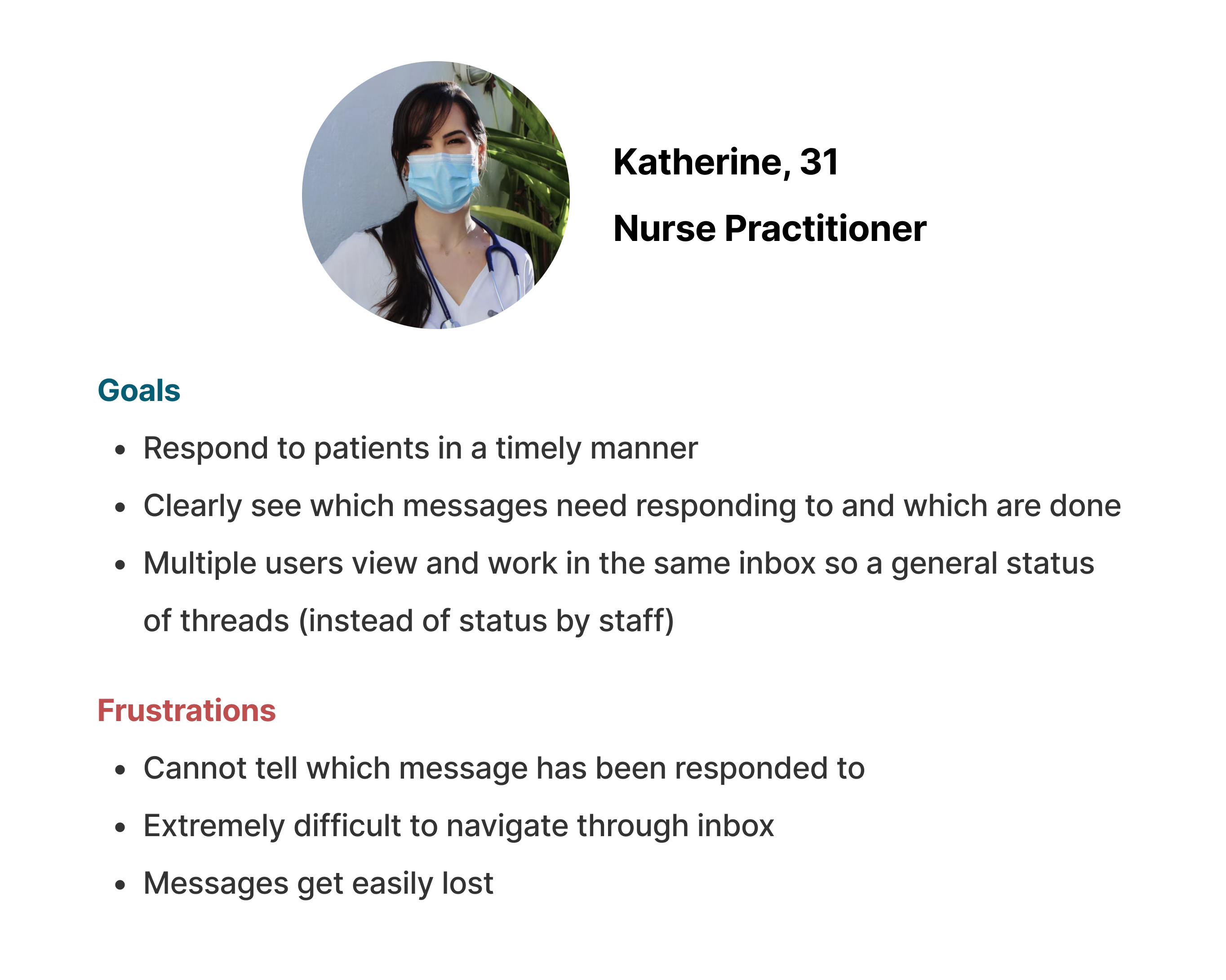
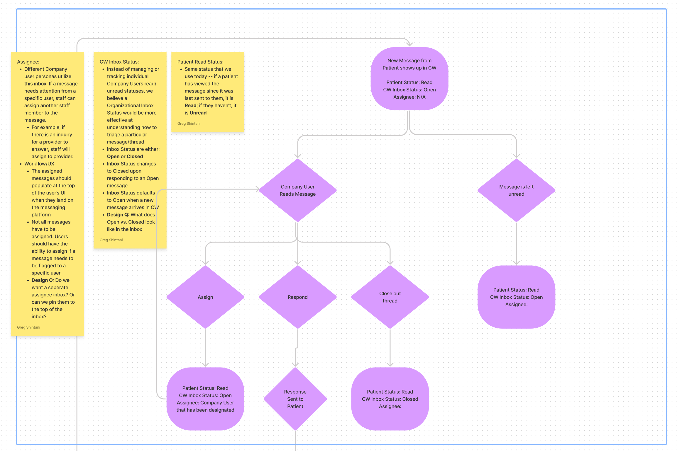
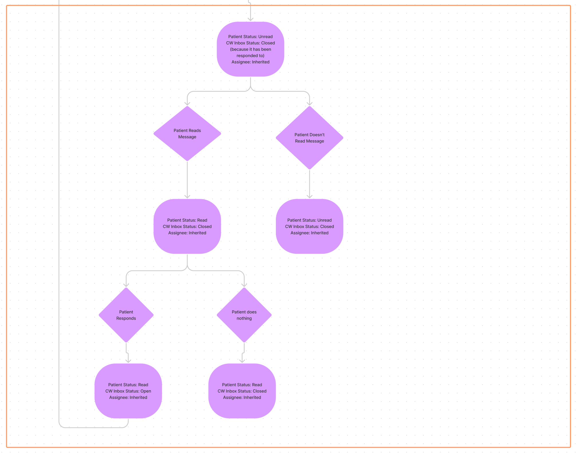
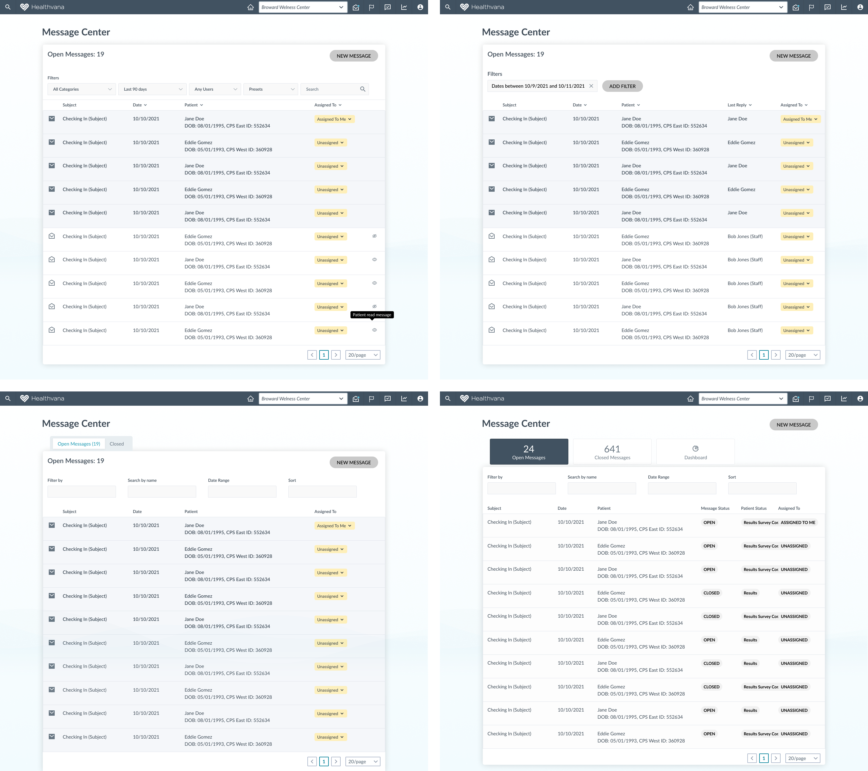
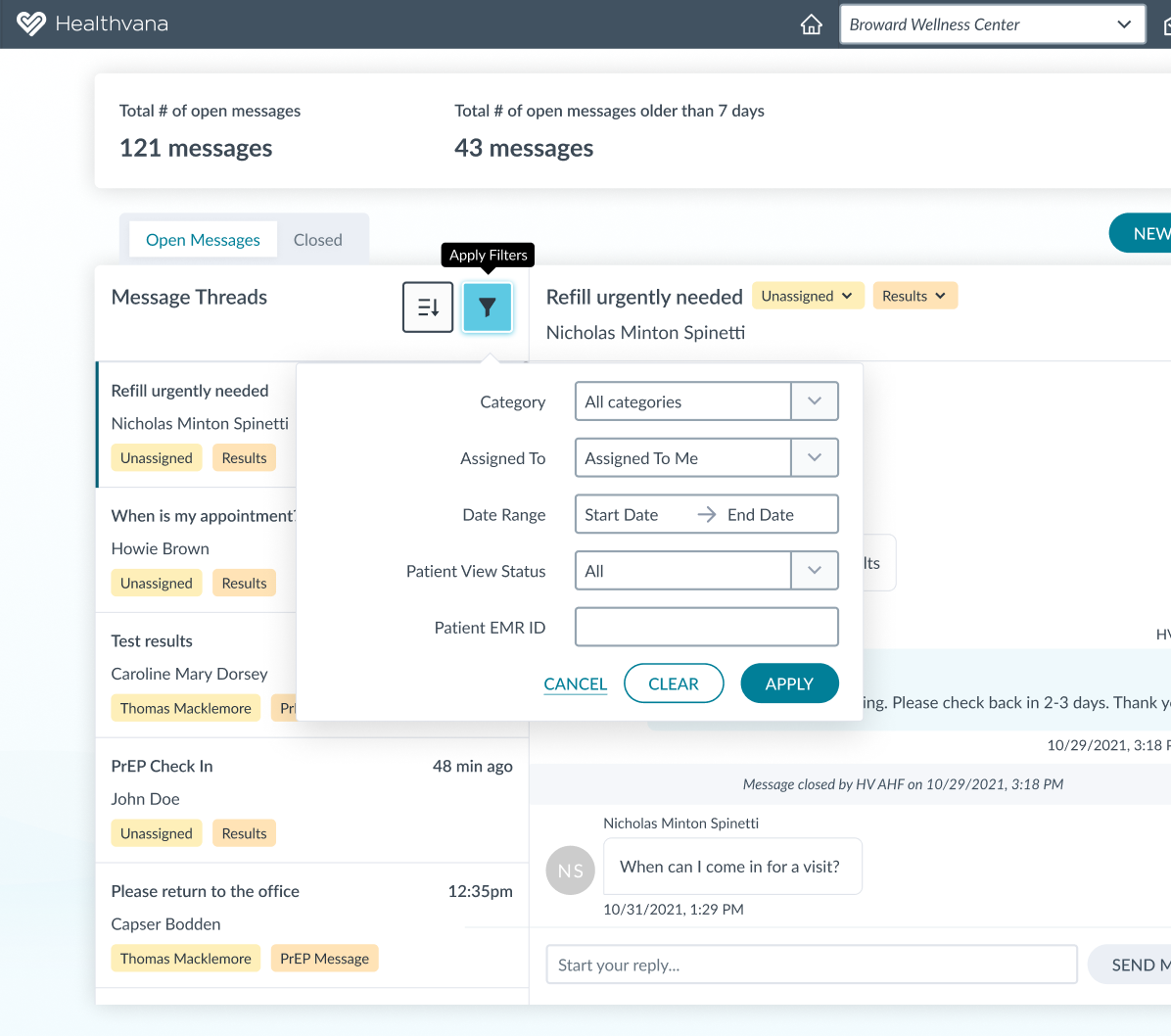
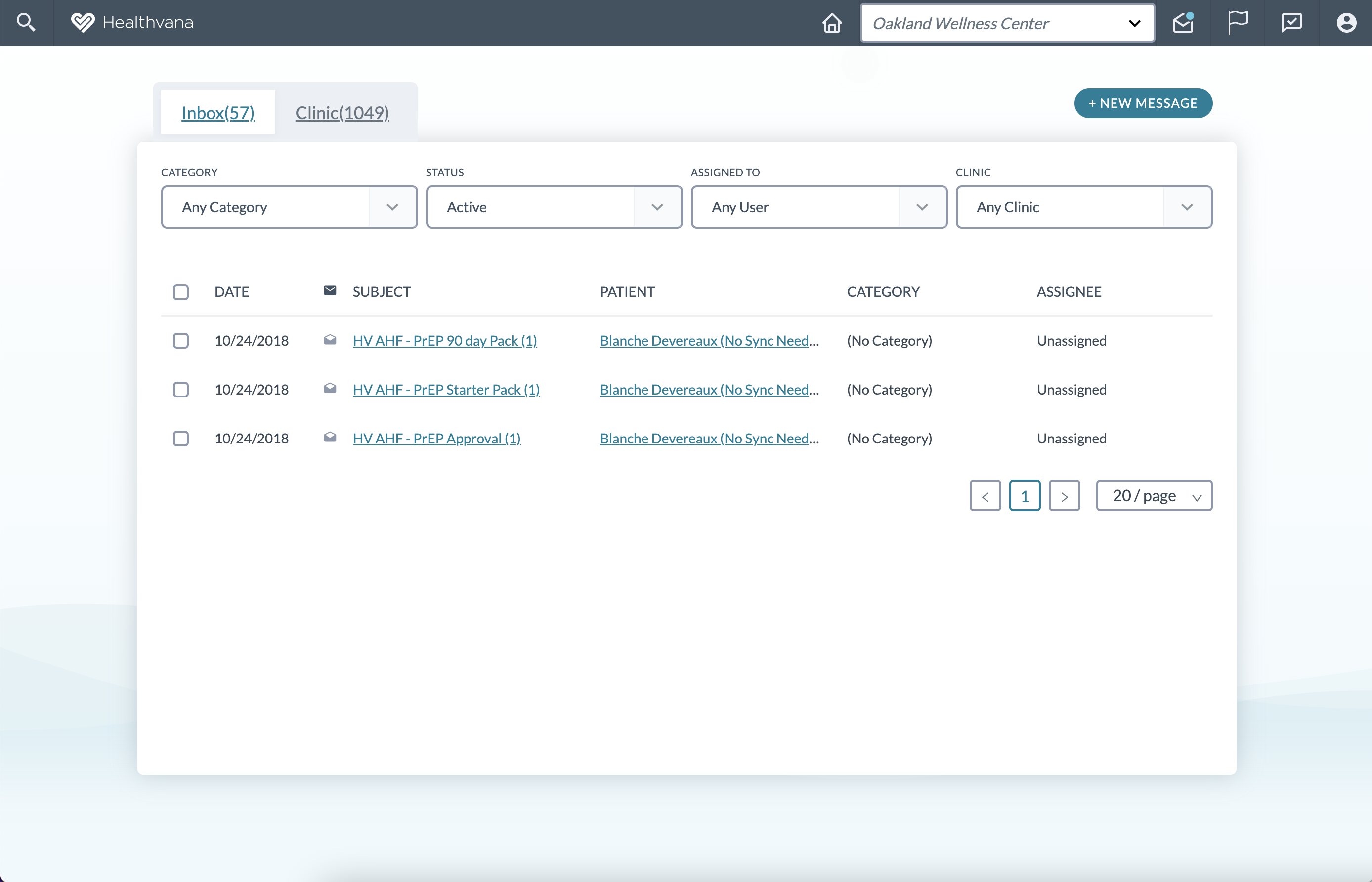
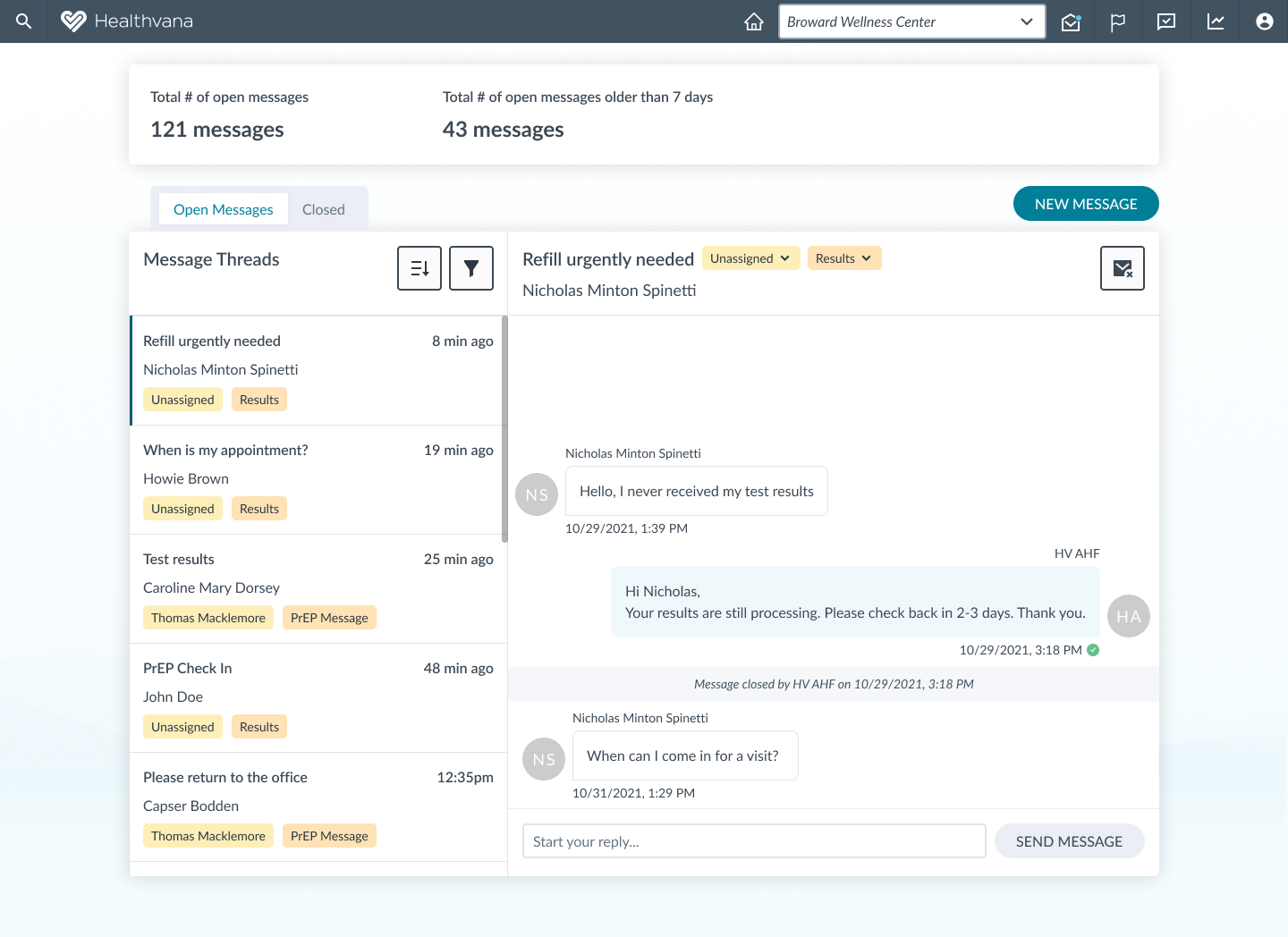
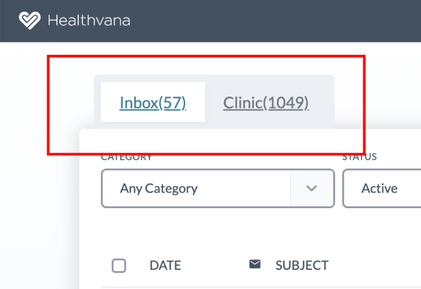
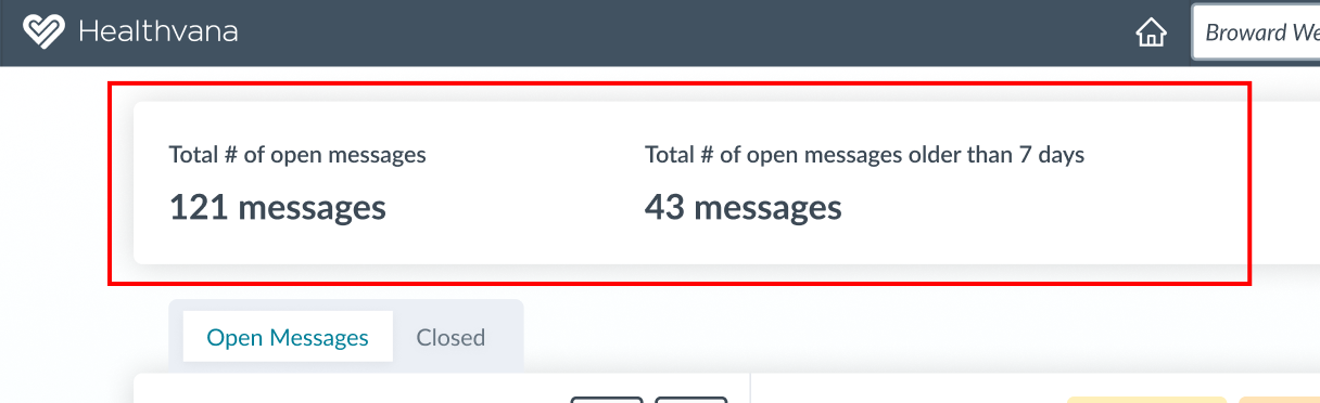
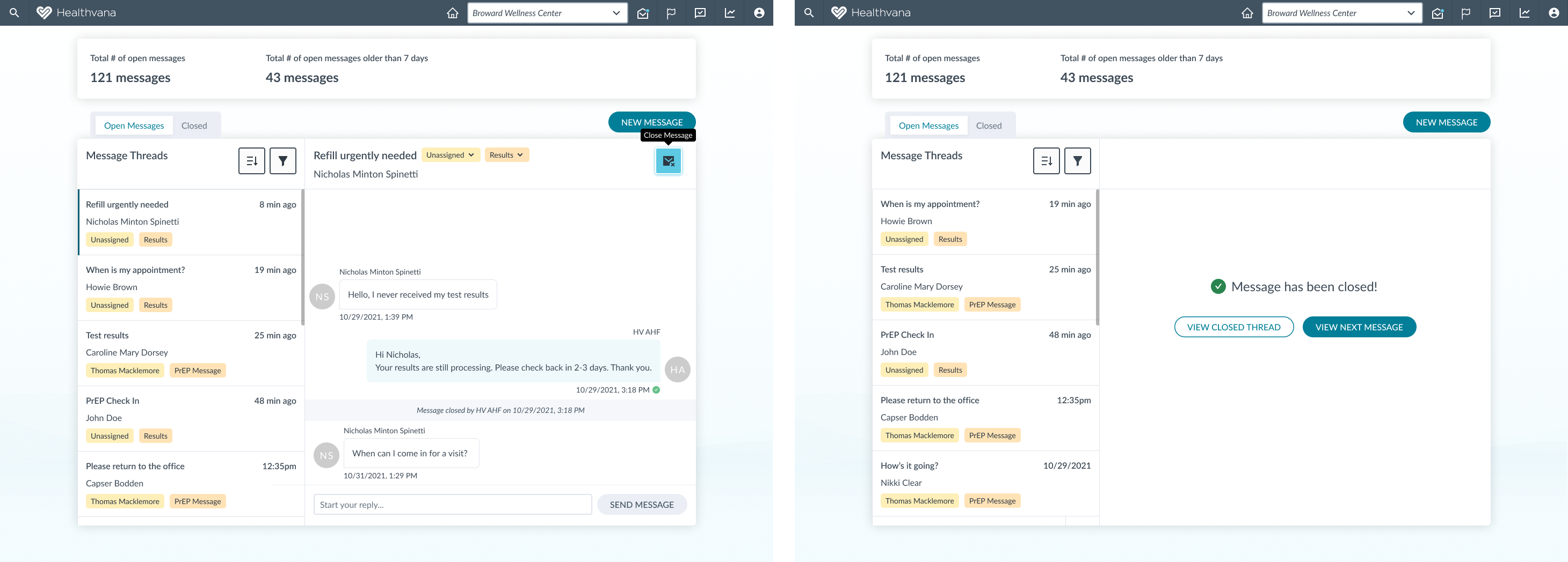
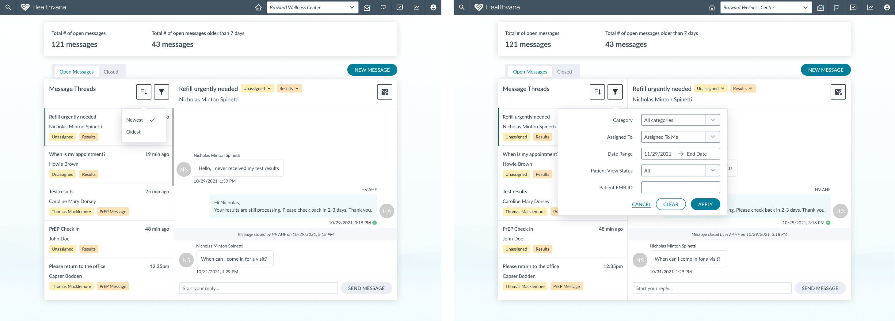
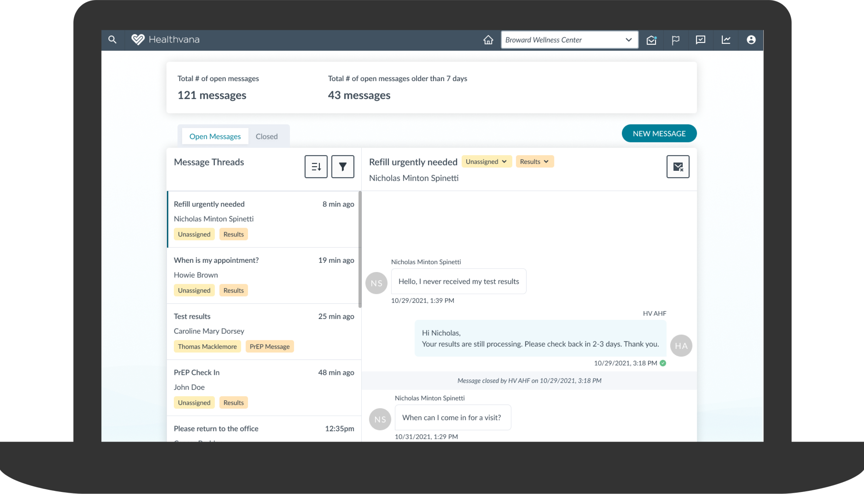
The staff is under-utilizing the messaging system.
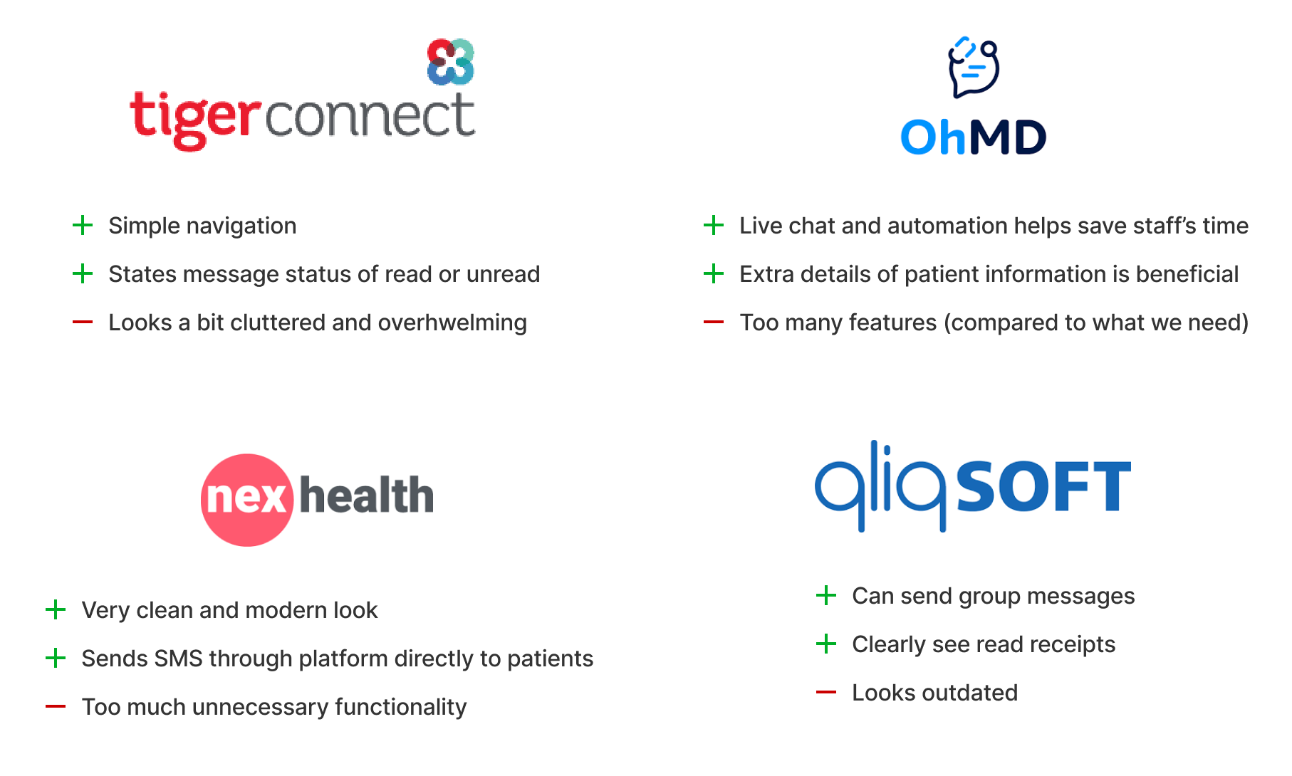
After speaking with our contacts at AHF, we realized that many of the staff members are not using the messaging system because of all the usability issues:
  • Difficulty navigating through the inbox
  • Confusing filters
  • Unclear which messages are read and unread
Research
Identifying frustrations and pain points
I worked with the product team to test our initial ideas about the underlying issues. We each individually conducted our own heuristic evaluations to fully understand how the feature works.

Then I wrote a user interview script and we interviewed 4 staff members of AHF who use or have used the messaging system.

We also did a competitive analysis to compare how other platforms utilize a messaging system.
User Interviews
  • 2 out of 4 use the messaging feature on at least a weekly basis
  • 3 out of 4 did not know how to properly use the filters
  • 4 out of 4 did not know what “status” meant or how to use it
  • 3 out of 4 believed that the inbox they were looking at was for a specific clinic when it was for all clinics
  • 4 out of 4 stated that it is not clear if a message has been read or is still unread
User Persona
After analyzing the interviews with the staff members, I discovered the difficulties that they faced with the messaging system. The usability issues were one of the major reasons why some clinics didn’t utilize this feature. As a patient engagement platform, it’s crucial for us to provide a simple and convenient way for staff to communicate with their patients. One persona emerged from the analysis and interviews, and it was important for me to refer back to the persona’s goals when designing and iterating.
Competitive Analysis
To gain a better understanding of the market and features, I researched competitors in the healthcare field who had messaging systems. While there were plenty of useful functionalities, many companies offered too much unnecessary features, which often resulted in an overwhelming feeling. We summarized our findings to focus on simplicity and clear navigation.
Design Goals
What is most important?
Our goal is to provide the most value to the staff when communicating with patients.

To get the staff to utilize the messaging system in an efficient way, we focused on improving 3 areas:
  1. Update inbox structure - It must be very clear to the user which messages need attending to and which don’t.
  2. Simple navigation and filters - It must be easy for the user to go through and either respond or close the messages from the patients.
  3. View analytics - Staff can see number of open messages and how quick messages are being responded to.
Flow chart of messages sent to the clinic
Ideation
Exploring layouts, functionalities, and ideas
It was time to bring our research, analysis, and thoughts to life. I iterated on several different layouts and flows using mid-fidelity wireframes to better visualize our ideas.
Different versions of inbox structure
Design Decision #1
Updating the Structure and Functionality of the Inbox
  • There are multiple staff members working in the same inbox so instead of a regular email system where messages are read/unread, messages are either “open” or “closed”.
  • Previously, all new and sent messages were placed in the same inbox. The subject line included the name of the person who sent the last message in the thread and the total number of messages in that thread.
  • A user can either respond to a message or click the “Close” button to close a message. To reopen, there is a way to go into the closed inbox and reopen messages. The goal of the staff is to close all messages.
  • The overall look was kept simple and clean to stick with the general style of Healthvana, where the main focus is on the patient and their needs.
Old Filter UI
Updated Filter UI
Design Decision #2
Navigating through the Inbox and Applying Filters
  • Split plane view will help the staff members more easily navigate through all the messages since they can see the threads and the content of a selected message.
  • A clear ActionButton that states “Apply Filters” when hovering will make it clear to the user on how to apply filters.
  • The filters provided are straightforward and understandable to all the users now.
Old Inbox Layout
Redesigned Inbox Layout
Design Decision #3
Viewing Analytics
  • The two inboxes in the old design were “Inbox” and “Clinic”, which actually meant “Assigned to me” and “All Messages”. The number next to those inboxes were the total number of messages ever sent, which were usually in the thousands.
  • There was never a clear indication of how many messages were new or needed responding to. With that, we decided to put that information clearly on the top of the inbox.
Old View of Number of Messages
Updated View of Number of Messages
Final Design
Inbox Layout
Closing a message
Sorting and Filtering
Assign and Update Category
Closed Inbox and Reopen Thread
Conclusion
By updating the inbox structure, simplifying the navigation and filters, and adding analytics to the messaging feature, we believe there will be an immense increase in usage.

The designs have been approved and will be implemented in November 2022. After this first round of updates are released, we will reach out to additional users for feedback.

Check out my other projects!