Performance.gov

Design Role
  • UX Research
  • UX Design
  • Visual Design
Deliverables
  • User Interviews
  • User Personas
  • Affinity Diagrams
  • Customer Journey Map
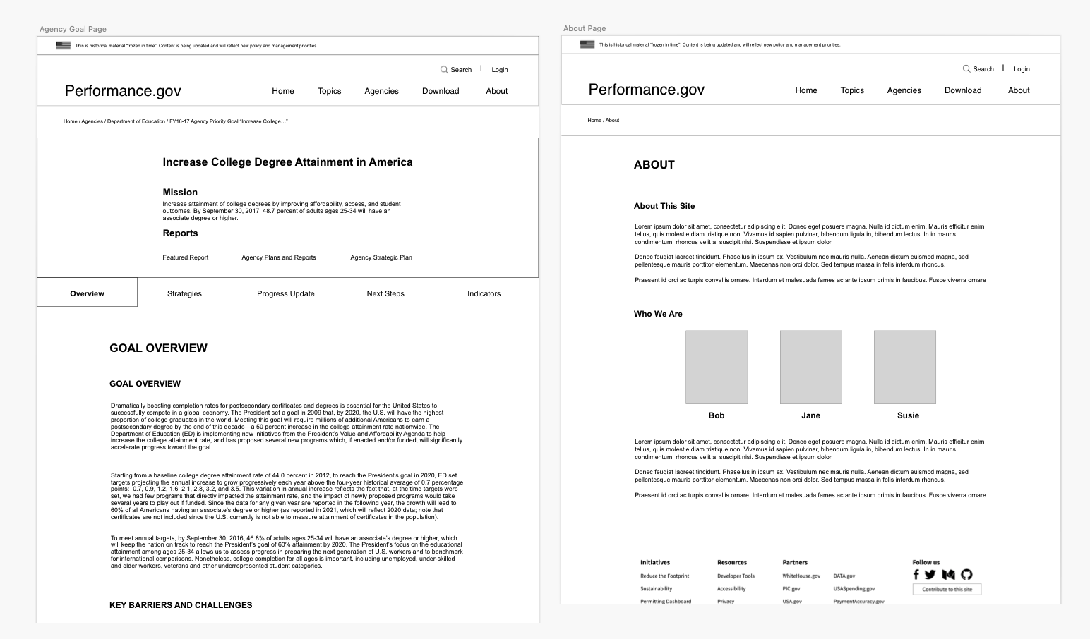
  • Wireframes
Specs
  • Duration
  • 6 months
  • Tools
  • Sketch
The Problem
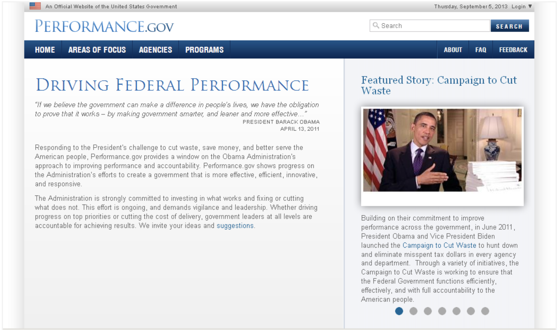
The objective of Performance.gov is to inform the public of all the progress being made in the White House. With that being said, there is a ton of information to take in, to organize, and to present to the public in a seamless way. Previously, the way Performance.gov had shown the data was confusing, messy, and archaic.

The goals were to find specific pain points from user research, to analyze and restructure the information architecture in a way that was clear, and to update the outdated visual theme to the new government design standards.
Before
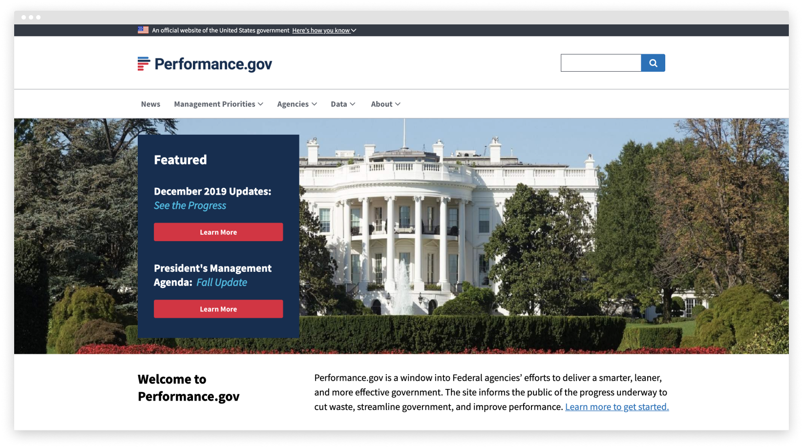
After
Discovery
Analyzing User Interviews
By the time I joined, the team had already finished interviewing about 20 people. They would ask the participant to briefly go through the website and then answer some questions while clicking through again. I combed through the findings to find pain points and confusing areas users had with the site. We identified the needs and grouped them under specific themes. We constantly updated and shared our ideas to pinpoint the ones that stuck out the most. Here are some of the questions we asked:

  • How long did it take to fully understand the layout on the website?
  • What stood out or what could have been better on the website?
  • What features should this website include?
  • What are some positive or negative emotions you felt?
  • Which parts were hard to navigate?

Here are a few direct quotes:

"The purpose of the website didn't take too long to understand. It took a little longer to understand the layout. Unless you standardize what all the departments are doing, it's impossible to present that consistenly."

"The way some information is presented... Sometimes you have to click on these massive reports without knowing what's in them."

"Reading a goal and seeing the outcome should be one continuous action, instead of reading a goal and searching for an outcome."
User Personas & Customer Journey Map
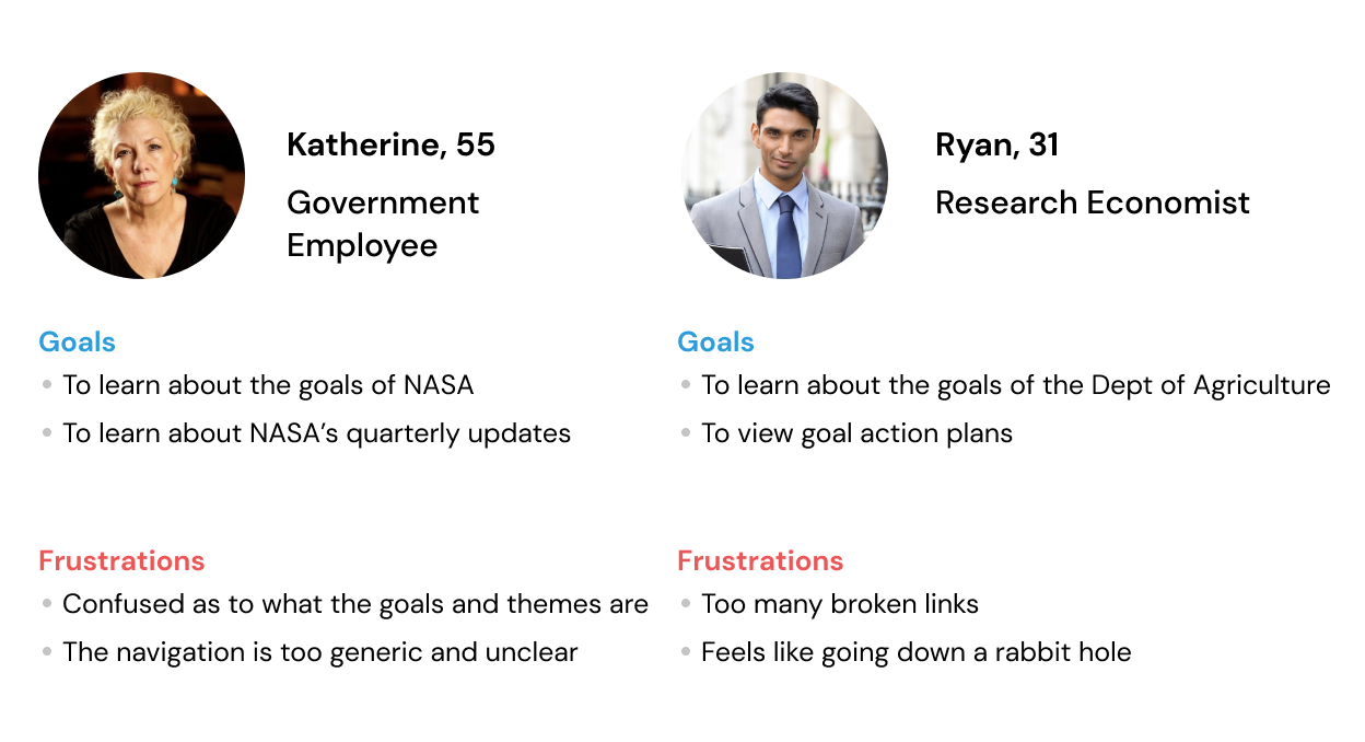
The next step was to create the user personas and customer journey maps. I teamed up with another intern and we dove straight into our user research. From all the data and analysis, we came up with two personas: government employees and people in academia or data research. We created two customer journey maps for each persona, filling out possible use cases, pain/pleasure points they could experience, opportunities they could come across. With the personas, we were able to focus more on the collective needs and with the maps, we tackled complex system design problems.

We also completed heuristic evaluations of the site to see if our findings matched with the user interviews. We categorized the general needs using sticky notes to see the bigger picture. This helped us clearly see which problems were most significant.

Information Architecture
Sitemap & Wireframes
After weeks of collecting and analyzing data, we were at a place where we could begin to bring our solutions to life. We knew that the information architecture was the biggest problem; users would get lost in rabbit holes of information with no idea how they ended up offsite.
My fellow intern and I decided to go through the whole site and find all the rabbit holes. We found where all the information was coming from and where the users would get directed when clicking on certain links. This gruesome process took some time but the end results were worth it. We mocked up high fidelity wireframes and prototypes, using inspiration and guidelines from other government sites and getting feedback from the director and the 18F team, the White House’s official digital services agency.
Final Product & Reflection
The End
The final redesign of performance.gov now supports the site's original purpose of educating the public about the Federal agencies' goals and efforts. The previous site was archaic, broken, and unusable. We helped with uncovering usability issues, reorganizing the navigation, clarifying confusing and messy areas, and modernizing the look and feel of the site.

We had come to the end of our internship and left our thoughts and designs to the Performance Improvement Council and 18F. Performance.gov has been updated. Enjoy!

Check out my other work!