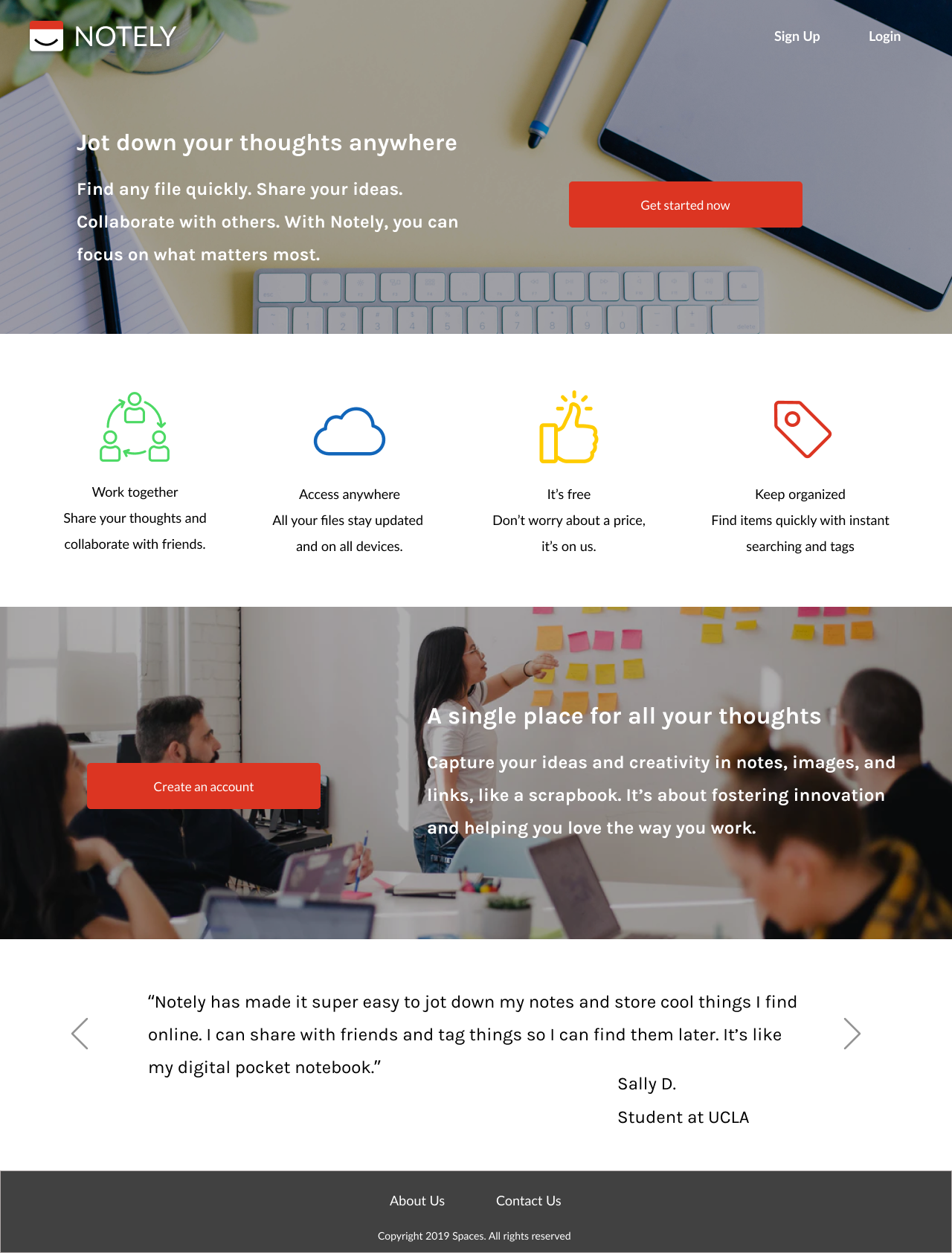
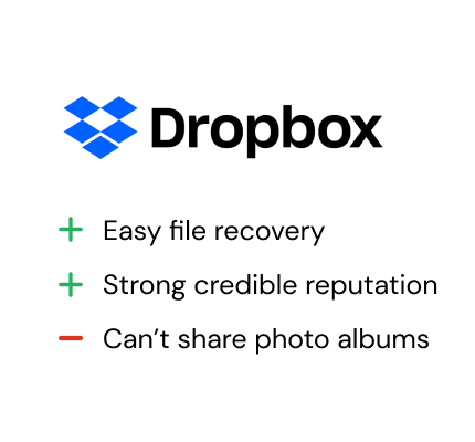
Notely

A simple note taking app

Design Role
  • UX Research
  • UX Design
  • Visual Design
  • Branding & Identity
Deliverables
  • User Surveys
  • User Stories
  • User Flows
  • Competitive Analysis
  • Branding
  • Sitemap
  • Style Guide
  • Prototype
Specs
  • Duration
  • 5 weeks
  • Tools
  • Figma
  • Sketch
  • UsabilityHub
Problem
Today’s market for cloud storage applications is saturated with products more catered towards businesses than personal use. As people become more reliable on cloud storage to create and save content, it quickly becomes unorganized.
Solution
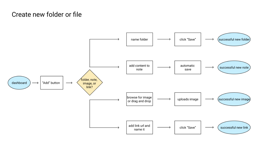
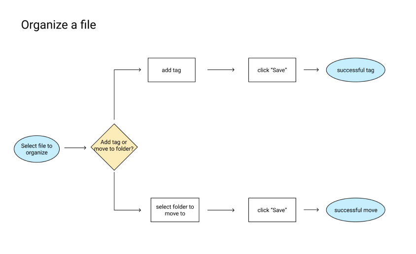
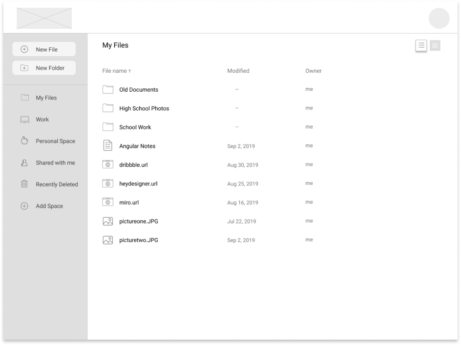
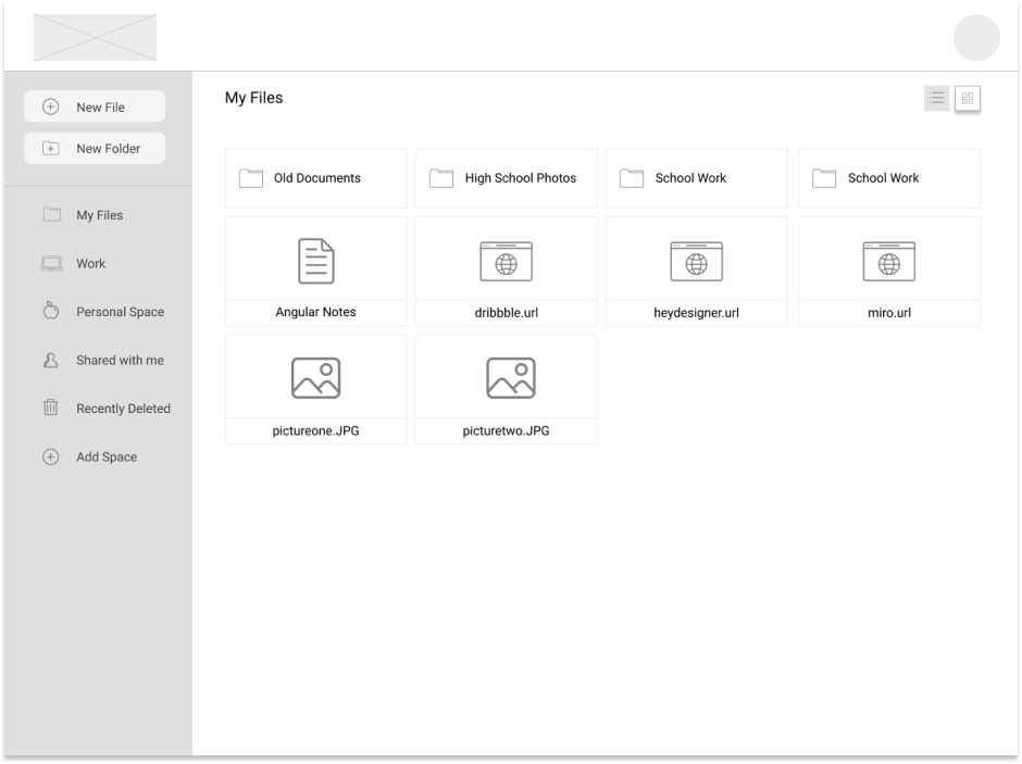
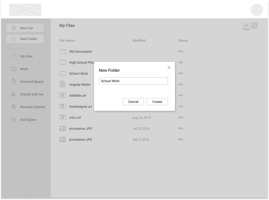
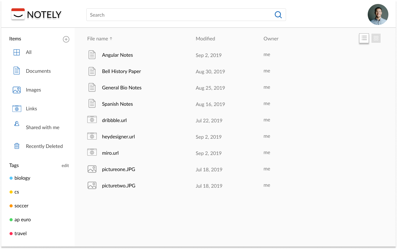
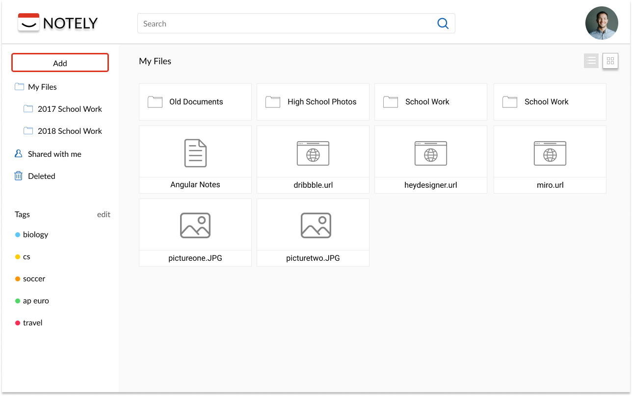
Notely is the simplified pocket-notebook for people to quickly jot down notes, collect their thoughts, and share their ideas. It is easily accessible and promotes organization by quick search results, folder structures, and the ability to tag content.
Part One | Discovery
Getting to know the users
To understand the users and their needs better, I conducted a Google survey from different areas throughout California.

94%

Find content that they want to save

82%

Prefer Google Drive

46%

Utilize cloud storage to save images

90%

Find sharing abilities useful

81%

Would find tagging abilities useful

100%

Want access to their files on their mobile devices

Key Problem Insights
The survey results helped me better understand the areas in cloud storage market that could be improved upon.
  1. Need an easily accessible space for personal use
  2. Focus on organization tools
  3. Simplier way to save content
Although I did gain some valuable insights, I also realized the questions I asked were too broad. I confirmed my theories about what people use cloud storage for and how they use it, but I could have asked deeper questions to uncover more specific pain points.
How's the competition?
Next was understanding the competition. While Google Drive, Dropbox, and Pinterest are three very reputable companies, there is always room for improvement. I noticed that files could get quickly cluttered and disorganized.
For Notely to stand out against the competition, it would need these distinguishing features:
  1. Multiple organization methods including folders, tagging, and searching
  2. Ability to save web links
  3. Accessible on all devices
Bringing the users to life
From the survey participants, I reached out to 3 individuals to interview. I found the main reasons why they used cloud storage and what they liked about it, but it was harder to discuss what problems they had with it because there was no major issues. From the surveys and interviews, two personas emerged. The common goals were efficiency and accessibility, meaning users want to quickly access their files on all devices. These are the main themes to keep in mind while designing and developing.
Part Two | Information Architecture
Defining the user goals for MVP
User stories help with simplifying the requirements of the project. It also helps prevent feature creep. This was important to establish in the beginning because clients may feel the need to add more features to stand out against competition. I brainstormed all the basic functionalities that Notely should have and then some more complex features. I prioritized the stories by which ones were absolutely needed for the MVP and which ones could come later. The user flows were a result of the top priority user stories: signing up for an account, creating a file, and sharing a file.
Building the skeletal structure
To have a better high level overview of the application, I created a sitemap. I needed to make sure the application’s layout was intuitive and straightforward before I began wireframing. I started off with very rough sketches of the landing page, main dashboard, and creating a new folder, and then I used Figma to create the low fidelity wireframes.
Usability Testing Round One
To begin testing, I created a prototype of the low-fi wireframes. I had participants test out three tasks: sign up for an account, create a folder, and share a file.

One of the key findings from the testing revealed that many users were confused by the concept of “Add Space”. I was trying to give users an easy way of categorizing their items by being able to create a “space” but it was essentially the same idea as folders. This was too repetitive and confusing so I decided to implement tags which gives users a simplier way to categorize their items.
Part Three | Branding & Identity
How Notely came to be
Notely aims to be playful yet professional. It is the friendly application you can depend on when you need to find that document or save a photo. You can trustly Notely with your thoughts and ideas like a digital scrapbook. I wanted the playfulness, professionalism, and friendliness to be exemplified by the brand and logo.
Evoking the right emotions
To capture the passion and enthusiam of Notely, red was chosen as the main color. I want people to be excited to open up Notely, not to think of it as just a storage space.

Lato was chosen as the primary typeface because it is simple, straightforward, and welcoming. Legibility and accessibilty were the driving forces in the font selection.
Part Four | Visual Design & Testing
Adding visuals to the skeleton
It was time to take the branding, project requirements, and user flows and transform all of that into the high-fidelity mockups. Referring back to the user personas and user testing data, I kept the goals of efficiency and accessibility in mind.
Experimenting with designs
To validate the design decisions being made, I used UsabilityHub to create some A/B tests.
Majority of the people preferred the red button because it is a clearer call to action.
The results were not statistically significant so the folder structure was chosen because it gives users more freedom and flexibility in organizing their files.
High-fidelity Prototyping Round Two
I performed another round of usability testing because feedback is imperative. This second round of testing revealed the following to be updated in the design:
Change #1: Lacking visibility of system status
I found that the application was lacking in visibility of system status. The users didn’t know if a note was being saved or a file was successfully shared.
Change #2: Image and link preview in grid view and during upload
Users thought the icons were being over used in the grid view and preferred to have an actual preview of the file. It would also be helpful to users to see a preview of the file while it is loading.
Part Five | Final Product & Reflection
What I learned
The challenges I faced during the creation of Notely taught me the importance of researching and understanding user objectives. Instead of focusing on the current cloud storage applications that are out there, I needed to take a step back and look at the bigger picture. Instead of asking how can I improve on the existing features, I needed to ask what about this product makes it user friendly.
If I had more time...
I realized that my target audience was too general. Most people who have used the reputable cloud storage applications have not faced many issues with it so it was harder to find their pain points. Instead, I should have interviewed people who don’t use cloud storage apps to uncover why they don’t and what would change their minds. I would do more market and user research.

Check out my other projects!