Sunday Night Dinner

Design Role
  • UX Research
  • UX Design
  • Visual Design
Deliverables
  • User Interviews
  • User Stories
  • Competitive Analysis
  • Prototype
Specs
  • Duration
  • 3 months
  • Tools
  • Sketch
The Challenge
Sunday Night Dinner is a Hollywood-based craft services company owned and managed by James Lee, an ambitious and successful entrepreneur. Since the company has been around since 1997, James sought out to redesign the SND's website to emphasize his passion as well as his beautiful crafty tables and other offered services. I worked on a team of four to deliver mockups, prototypes, and a responsive functional website.

Our client was interested in getting users to visit the newly redesigned website to get more information about the services provided and to directly call him for business deals. Since the old website was entirely outdated and only partly functional, the client welcomed the idea of a complete rebranding of the website using their logo as the basis.
The Solution
We first focused on gathering all the research about the client and the target audience. With the client's goals and expectations in mind, we came up with a sophisticated, clean website that allows people to easily look up services offered and to call James quickly and directly.
Discovery
Interviewing the users
We conducted a series of 10 interviews to gain a better understanding of how the craft service hiring process happens. Our goal was to determine basic pain points when hiring a craft service company and what information is essential. We gathered some useful feedback about how production managers go about hiring a craft service company, what they look for, and what their expectations are. Some of the questions we asked were:

  • What quality of a craft services company do you find most important?
  • What specific services have you previously chosen to hire from a craft company before?
  • How did you hear about certain craft companies?
  • What is the process like to book their services?
  • How often do you hire crafting services?

Here are a few direct quotes:

"We specifically look at types of services and the food. We want the crew to be happy."

"Professionalism and presentation are the most important qualities."

"It's important for me to see if the craft company has healthy options."
User Personas
From the interviews, we found that there were three major client groups: Production Managers, Event Coordinators, and Yelpers. Understanding the target audience groups helped us further narrow down their needs and goals. Two personas emerged and we used them to guide us thoroughout the rest of the project.
Competitive Analysis
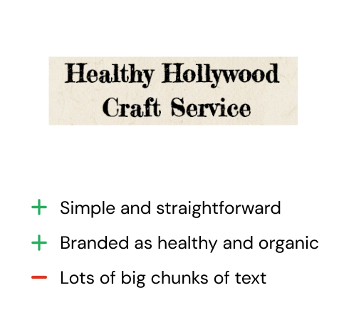
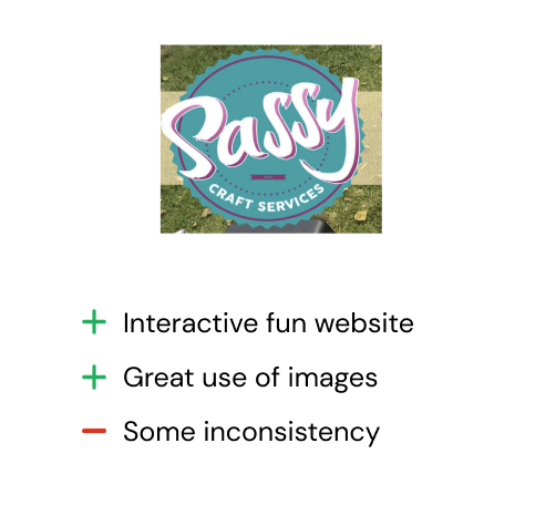
Next was understanding the competition. While Google Drive, Dropbox, and Pinterest are three very reputable companies, there is always room for improvement. I noticed that files could get quickly cluttered and disorganized.
For Sunday Night Dinner to stand out against the competition, it would need these distinguishing features:
  1. An outstanding, reliable, trustworthy, and clean design
  2. Ability to directly call the owner
  3. Accessible on all devices
Information Architecture
User Scenarios, Use Cases, & Features/Functionality
With the diverse amount of data gathered, we were able to create many different user scenarios and use cases that we could potentially incorporate into the development of the SND website. We were also able to extract specific features and functionalities that we thought were necessary to have in order to create a website that all users can be happy with.
Wireframing
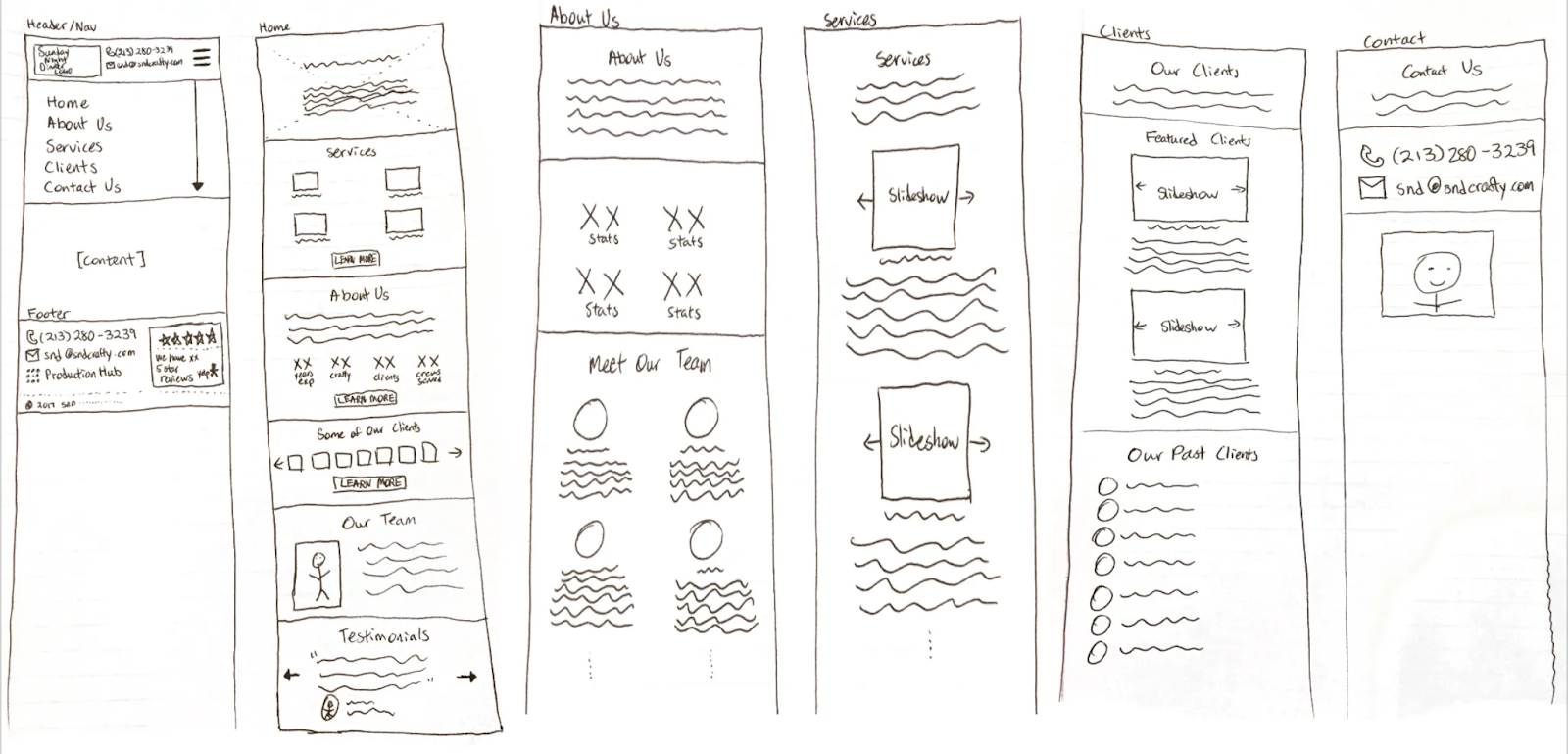
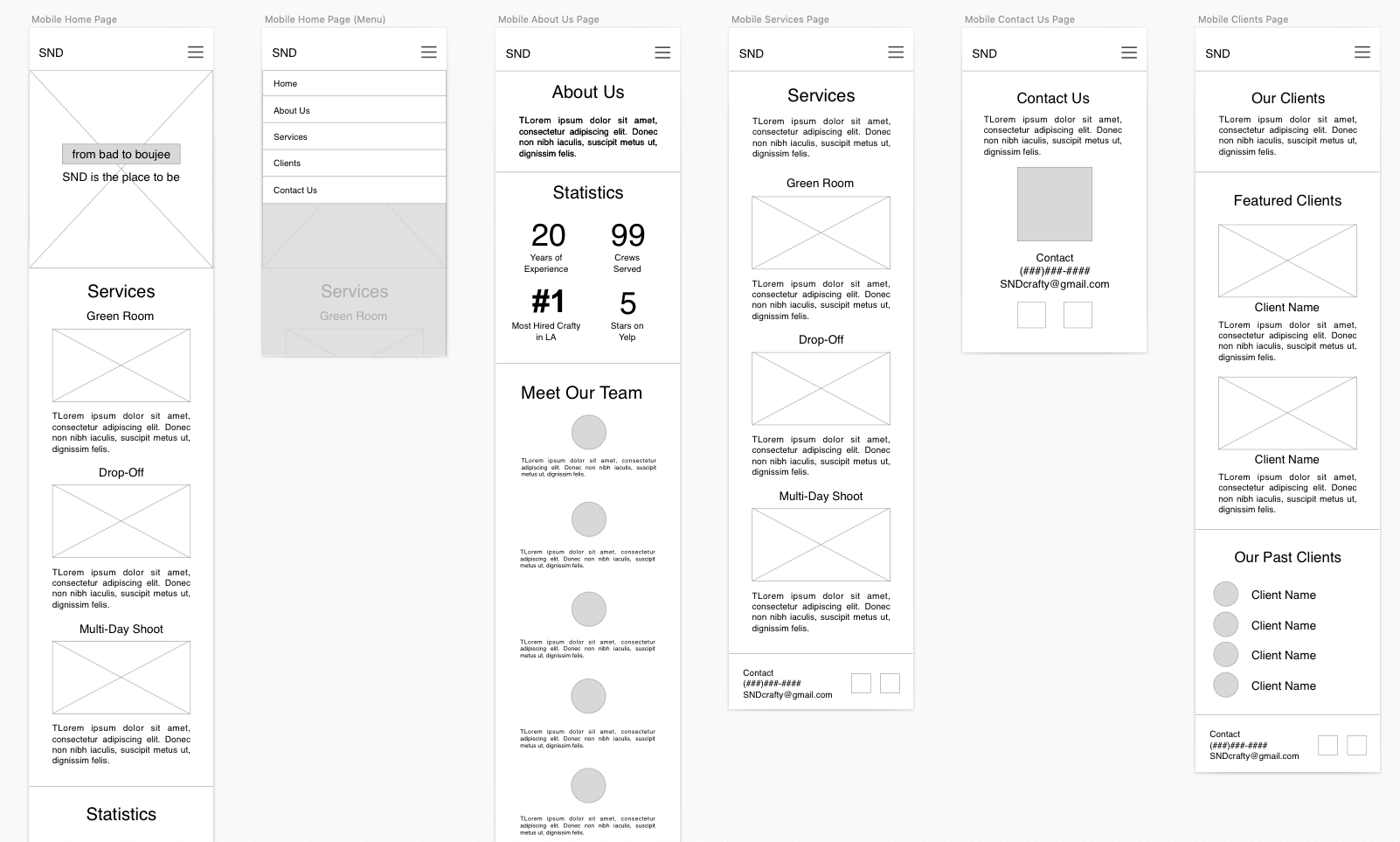
In order to have a clear understanding of the website structure, we created a sitemap. We needed to make sure that the layout was straightfoward and that we weren't missing any parts before wireframing. We started off with very rough sketches of all the pages, and then we used Sketch to create the low fidelity wireframes.
Visual Design & Client Feedback
High Fidelity Mockups
Now it was finally time to put everything together. Referring back to the user personas and client requirements, I kept the goal of accessibility and theme of simplicity in mind.
Beautiful & colorful images
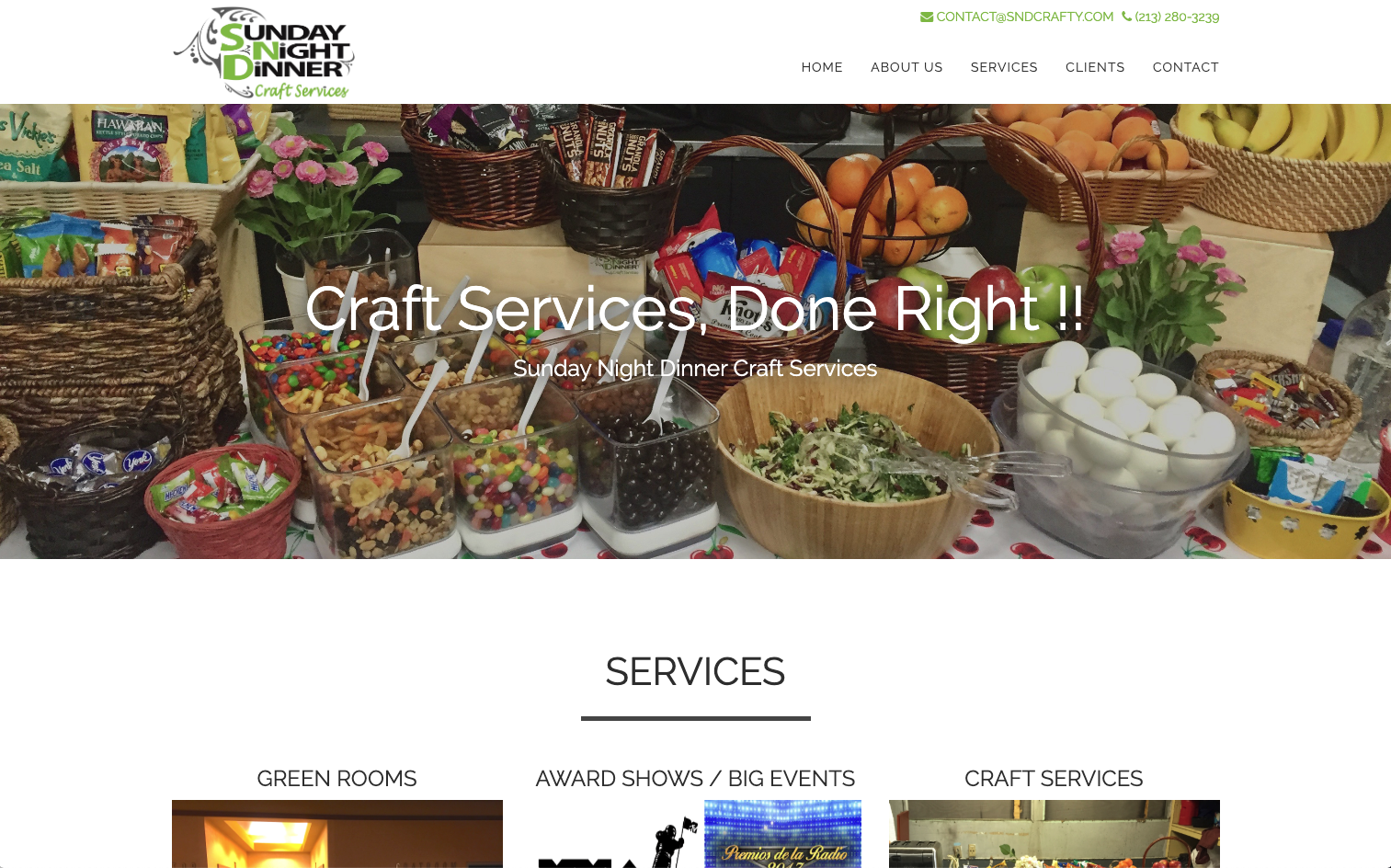
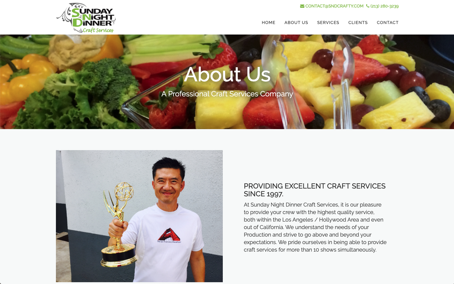
It was especially important to the client that the website was colorful and filled with bright images to emphasize the company's personality. We had hero images on every page and lots of other fun pictures thorought the site.
Straightfoward and Clean
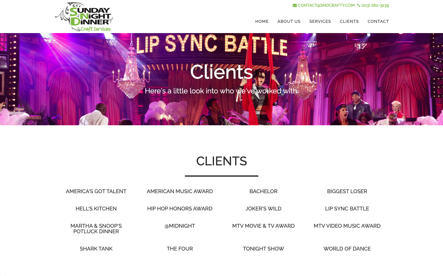
We made it very easy to access all the important information a user would need to see. All the services are listed with a short description and picture. The client list looks impressive but not cluttered.
Call at any time
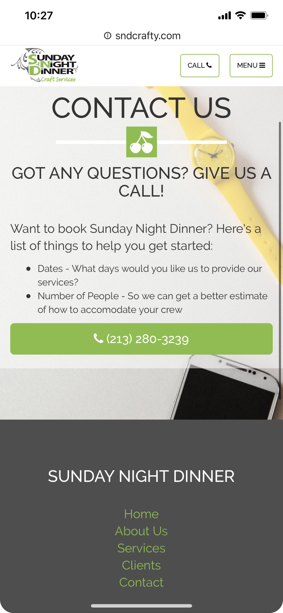
Since the end goal of the user is to call the owner directly, we made the phone number accessible from any part of the site.
Final Product & Reflection
What I learned
With more time and resources, I would have liked to taken higher quality pictures and worked on the branding a bit more. We mainly focused on easily viewing important information and bringing passion into the site.

This was my first client project, and the lessons I learned helped build a strong foundation in UX. Communication is key - between the team and the client and within the team itself. All of us had to make decisions, point out our mistakes, and be open to feedback.

This project went live in 2018 and it has been quite successful! The client reported that his sales has increased and many business deals began from the website. It is truly empowering to see how UX can illustrate personality and propel businesses.

Check out my other projects!